
01 · The Tension
Safety as Surveillance
In 2020, the word "safety" had baggage. Especially for parents. Especially for kids. The category was built on fear — location tracking, screen time limits, content filters. The message was always some version of: we're watching you.
Microsoft Family Safety entered a market that had trained families to see digital protection as a form of control. The product had genuine warmth built into it — shared location that felt like care, not monitoring; screen time that opened conversations instead of closing them. But none of that mattered if the story led with the wrong emotion.
The Core Tension
Parents wanted visibility. Kids needed autonomy. Any campaign that solved for one at the expense of the other would ring false. The brief wasn't to pick a side — it was to find the third thing both could agree on.
02 · The Reframe
From Control to Clarity
The insight that changed everything was deceptively simple: safety isn't about knowing where your kids are. It's about knowing they feel safe enough to reach out. That reframe shifted the entire campaign from surveillance language to connection language.
We didn't lead with the features. We led with the feeling. The campaign wasn't built around screen time limits or content filters — it was built around the shared exhale a family feels when they know everyone is okay. The features became proof points, not the headline.
We didn't lead with control. We led with clarity. And clarity, it turns out, is what modern families were starving for.
This required real courage from the product and marketing teams. Surveillance messaging performs well in short-term acquisition because fear converts. Choosing connection over fear meant accepting a slower, more earned kind of trust — one that would compound over time rather than spike and fade.
03 · Motion & Humanity
The Campaign That Felt Human
The narrative reframe shaped every executional decision. The hero film was deliberately non-verbal — not a single line of product copy. Just moments. A teenager arriving home. A parent's phone lighting up. The quiet relief of a notification that says: she's here. We're okay.
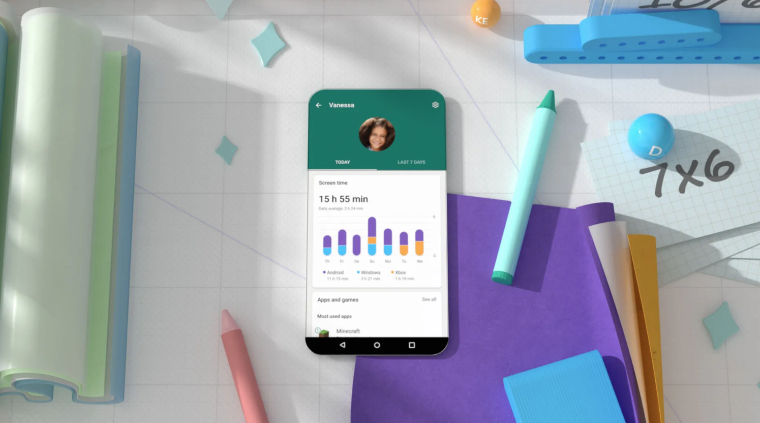
We called the character Vanessa. Not because she was a spokesperson, but because she was a container for the story we were trying to tell about autonomy and trust growing alongside each other. Her journey across the campaign gave the product a human arc — not just a feature list.
A symbol of safety that feels human.
Not watched. Held.
The visual system followed the same logic. The stylized heart. The soft gradients. The teal palette chosen specifically because it sits between trust and calm — not the corporate blues of enterprise software, not the alarming reds of warning systems. A color that said: you're going to be okay.
04 · Earning Trust
When Story Becomes Safety
Families told us they traded "Where are you?" texts for a collective exhale. That sentence is worth more than any metric. It means the story landed where we aimed it — not in the head, but in the chest. Not in the rational evaluation of features, but in the felt sense of being understood.
The numbers validated the strategy. But the more durable result was a proof of concept about the category itself: when you stop leading with fear and start leading with trust, families don't just download the app — they advocate for it. The campaign didn't just launch a product. It launched a philosophy.
This is how we earned trust during a global crisis. Not by promising control — by offering connection.
This article reflects professional experience and strategic opinion from firsthand involvement in the launch. Specific metrics reflect reported campaign outcomes. It draws primarily from real-world practice rather than universal rules.