
01 · The Problem
Browser Marketing
Is Usually Boring.
Most tech companies treat support content as an afterthought. It lives in dusty FAQs and dry help articles. And when we looked at how people were actually behaving, the gap was obvious: they weren't reading the docs. They were searching YouTube for answers and finding nothing useful.
Edge had genuinely powerful features — built-in coupons, immersive reader, collections, vertical tabs. Features that could change the way people moved through their day. But if users don't know a feature exists, it might as well not exist. Confusion isn't a barrier. It's a signal of intent.
The Insight
People who are asking how to do something already want to do it. The question isn't whether they're interested — it's whether we're showing up in the right place, in the right format, with the right emotional register.
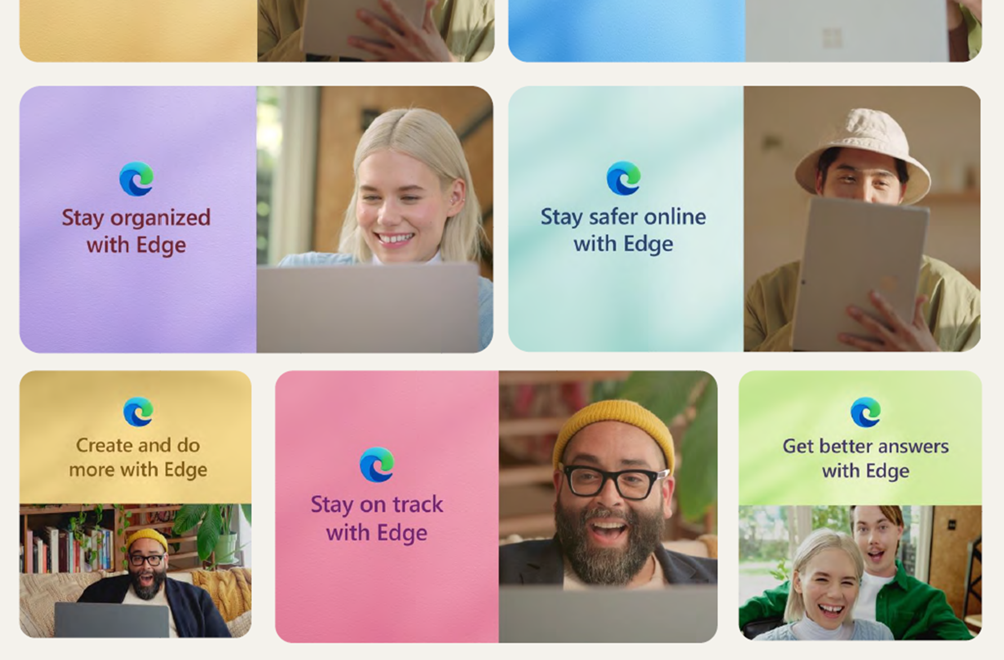
We saw an opportunity to turn "Support" into "Discovery." But we made a decision early on: we didn't want to make tutorials. Tutorials are about clicking buttons. We wanted to make Lifestyle Proof-of-Concepts — content that showed the software living in the world, not sitting in a manual.
02 · The Narrative
The Formula We
Built From Scratch
Each video followed a tight, 30–40 second structure designed to respect the viewer's intelligence while moving fast enough to hold their attention. We tested. We iterated. We threw away the first version. The final formula had three parts — and the order mattered enormously.
Step 01
The Hook
A relatable human scenario — "How to plan a birthday" — never a feature name. The viewer had to see themselves before the product appeared.
Step 02
The Demo
Rapid-fire and aspirational. We showed the result of an action, not the mouse cursor moving. Competence without friction.
Step 03
The Bookend
The human host returns. Face-forward, back in the real world. Trust was built at the start; the payoff delivered at the end.
The Human Bookend Rule
The host appears at the start and finish — never in the middle. The face builds trust. The UI builds competence. Mixing them kills both.
The host is a frame, not a presenter. Once the browser is on screen, it has to speak for itself.
03 · The Visuals
UI as Hero Object
This wasn't screen recording. That was the first and most important decision we made in pre-production. Screen recordings capture the mess of real browsing — the 50 open tabs, the notification banners, the toolbar chaos. We wanted none of that.
Instead, we "lifted" the Edge browser out of the operating system entirely. We placed it in a stylized 3D environment — clean, directional light, floating geometry. Deconstructed UI. The browser became an object you could fall in love with, not a utility you reluctantly opened.
This wasn't deceptive. It was aspirational. It showed the software as it feels when you're in flow — not as it looks when you're distracted. We gave viewers permission to imagine a better version of their own digital experience. That's a different kind of product marketing entirely.
The Aesthetic Decision
Every stylistic choice — the floating UI, the clean environment, the deliberate camera moves — was built to say one thing: this software is worth your attention. That required removing everything that said otherwise.
04 · The Payoff
Digital to Physical.
The Money Shot.
Every script we wrote had a single structural requirement: the ending had to dissolve the digital back into the real. The browser helped you plan the birthday — so the video ended at the party. It helped you book the trip — so it ended with the packed suitcase. The screen faded into the outcome.
This was the proof. Not the feature. Not the UI. The real life on the other side of the click. We called it the "money shot" internally — the moment where the software stopped being software and became evidence of a life lived better.
We don't teach features. We show outcomes.
The pilot was 6 videos. But because we built a modular system — not just a video — those 6 assets were remixed into 100+ social cuts, paid media variants, partner co-brands, and localized versions across markets. Not a single reshoot.
The 25% reduction in support tickets was the number that made internal stakeholders stop talking about views and start talking about value. When people understand what a product can do — not because you told them, but because they saw themselves in the story — support load drops. That's the compounding return on content done right.
This article reflects professional experience and strategic opinion from firsthand involvement in the campaign. Reported metrics reflect actual campaign outcomes. It draws from real-world practice rather than universal rules — your mileage, as always, may vary.