
The Strategic Pivot
In Spring 2021, the world was navigating a hybrid reality. Microsoft faced a defining opportunity: repositioning Teams from a B2B utility into a consumer platform that could bring families and friends together.
The challenge was entirely perceptual. How do you take a tool synonymous with "Work Meetings" and spreadsheets and transform it into a space for virtual dinner parties and family game nights? We needed to prove that Teams understood that work and life were no longer separate — they were irreversibly integrated.
"Enterprise equity is a ceiling until you make it feel human."
This wasn't a brand refresh. It was a repositioning with real business stakes. The pandemic had created a rare moment of openness — people were using video calls for everything. We had to claim that space before it receded.
The Teams consumer launch ran in parallel with the broader Microsoft 365 rebrand, requiring careful orchestration to ensure both narratives reinforced rather than competed with each other across all channels.
Campaign Architecture
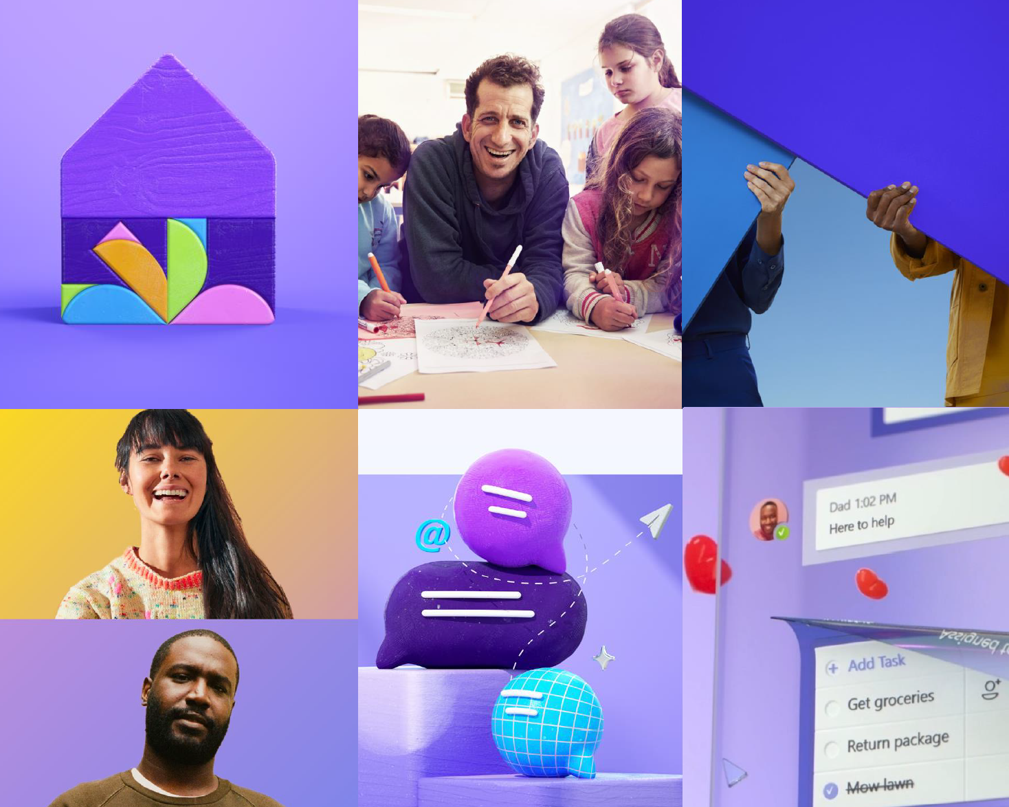
The "Action + Together" positioning framework — Teams as a space for doing, not just talking.
We developed a modular Bill of Materials (BoM) approach. The core construct centered on "Action + Together" — shifting the narrative from "talking" to "doing." Teams wasn't just for chatting; it was for planning, organizing, and experiencing life together.
Modular BoM
A flexible creative system that mixed and matched across platforms while maintaining brand consistency at global scale.
Humanized Enterprise
Moving from "Enterprise Blue" to a warmer, more human visual language — without surrendering the premium equity Teams had built.
3D Identity System
A custom 3D emoji language developed with Buck that signaled playfulness and announced Teams as a space for real life.
The Catalyst: "The Power of We"
The campaign needed an emotional anchor. We created a 35-second film that stripped away the UI and focused purely on the human connection that technology enables.
No feature demos. No product shots. Just people, together — cooking, celebrating, showing up for each other across the distance the pandemic had created. The film ran across global digital channels and became the emotional proof point the whole campaign architecture was built around.
"The Power of We" — the hero spot that aired across global digital channels, Spring 2021.
Visual Language & Execution
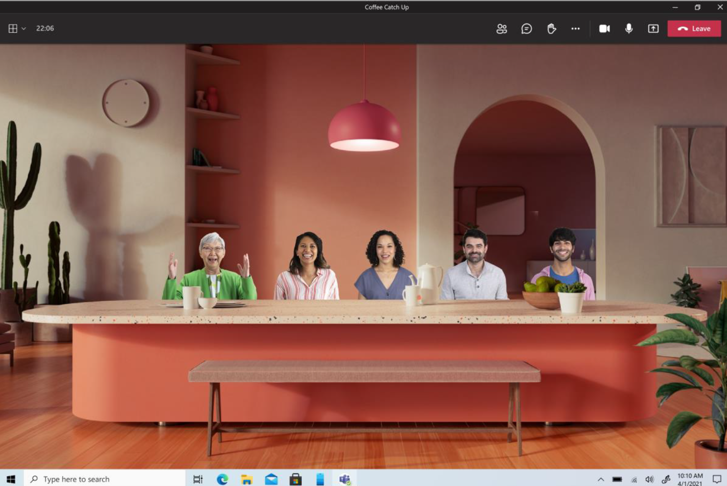
To support the repositioning, we introduced a softer, more vibrant visual identity. This included the "Together Mode" innovation — removing the grid to place people in a shared virtual environment, a feature that became one of the most covered news stories of the launch.
The full visual language system developed for the consumer launch, spanning digital, OOH, and social.
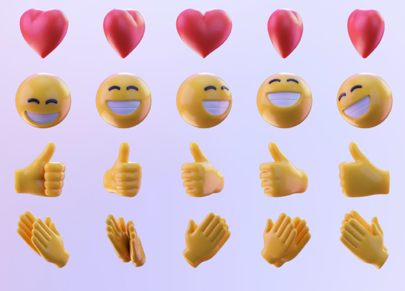
The 3D emoji system — developed in partnership with Buck — was one of the most deliberate signals in the campaign. Emojis carry a specific social connotation: they belong to personal, informal communication. Introducing them into Teams was a statement. This product lives in your real life now.
Performance
The launch exceeded every benchmark across impressions, downloads, and sentiment. The campaign proved that enterprise equity, repositioned with care and intention, can move consumer audiences at scale.
Read the Narrative Strategy
Go beyond the metrics. Read my personal reflection on repositioning a global brand during a pandemic — and why the emotional work mattered as much as the execution.
Read the Article →